Photographing glaze so the colour survives the screen
Handmade and craft sellers · July 2, 2026 · 5 minute read
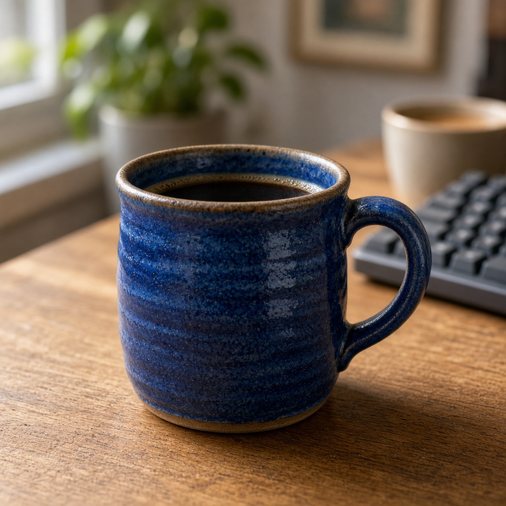
There is a particular frustration known to everyone who glazes: the piece in your hand is a deep, complex blue-green with depth you spent three firings developing, and the photograph is grey. Not wrong exactly. Just flat, and lifeless, and not what you made.
This happens for reasons that are entirely technical and mostly fixable, and understanding them is more useful than another round of editing.
Glaze is two things at once
The reason glaze is harder to photograph than almost any other surface is that you are photographing two separate optical events simultaneously.
There is the body colour, which comes from light entering the glaze, bouncing off the pigment and clay beneath, and coming back out. This is the colour you think of as the glaze colour.
And there is the specular reflection, which is light bouncing straight off the glassy surface without entering it at all. This carries no colour information about the glaze. It is simply an image of whatever is in front of the pot — your window, your ceiling, your face.
A photograph that is mostly specular reflection shows a grey-white pot with a hint of colour. A photograph that suppresses specular reflection entirely shows a matte, dead pot with no gloss. What you want is a controlled amount of both, and where you put the light decides the ratio.
Move the light, not the pot
The single most effective change: stop photographing pieces with the light behind you.
Light coming from directly behind the camera bounces straight back off the glaze into the lens, which maximises specular reflection and washes out the body colour. This is what a phone flash does, and it is why flash photographs of glazed work look so bad.
Move so the light comes from roughly forty-five degrees to one side and slightly above. The specular highlight moves off the front face of the piece and becomes a defined band along one edge, which reads as gloss without swamping the colour. The body colour comes through, and the form of the pot becomes legible because there is now a gradient across it.
Big soft light beats small hard light
Glaze rewards a large light source. A window is ideal because it is enormous relative to a mug, which produces a soft gradient of reflection rather than a hard bright dot.
If you are working at night, a bare bulb is the worst option available — small, hard and usually orange. A cheap alternative that works surprisingly well: bounce a lamp off a white wall or ceiling so the wall becomes the light source. You lose brightness and gain size, which is the correct trade for glossy surfaces.
Backgrounds change the colour you see
This one catches people out because it is a perceptual effect rather than a camera one.
Place a celadon bowl on a warm wooden table and it will look greener. Place the same bowl on a cool grey surface and it will look bluer. Nothing about the glaze changed — human colour perception is relative, and the surroundings shift what you see.
This matters commercially because the buyer forms their expectation from your photograph and then unpacks the piece onto their own table. Photographing on a neutral mid-grey or a soft off-white gives the least biased reading, which is the fairest thing you can do.
It also means your product photographs and your lifestyle photographs will show slightly different colours, and that is unavoidable. Make the listing's main image the neutral one.
Photograph the inside of the vessel
A specific tip that sells work: for bowls, mugs and vases, photograph looking into the piece as well as at it.
Glaze pools differently inside. The colour is often deeper, the breaking over the rim is visible, and any variation across the surface — which is the thing that makes hand-glazed work worth buying — is more apparent. Buyers of ceramics are frequently looking for exactly this, and a listing that only shows the outside profile is withholding the best argument for the price.
Calibrate against the real thing
Before you publish, put your phone next to the actual piece, in daylight, and compare.
This sounds obvious and almost nobody does it. Look at the photograph and the pot side by side and ask whether a stranger seeing only the photograph would be surprised by the pot. If the answer is yes, adjust — usually by reducing saturation slightly, since phone processing tends to push colour harder than reality.
Where restaging helps and where it does not
Relighting a photograph can put a piece on a clean, neutral surface with soft, well-placed light, which fixes the background bias and the harsh-highlight problem in one step. Because the colour and surface come from your reference photograph, a piece photographed with accurate colour stays accurate.
What it cannot fix is a photograph where the specular reflection has already blown out the body colour, because that information is genuinely absent — there is no colour data under a white highlight to recover. Get the light off-axis first, then stage.