The minimal look
Minimal is a decision, not an absence of one
An empty background is the easiest look to describe and the hardest to get right, because with nothing else in the frame every flaw is the subject.
Sized and staged for Shopify · Amazon · Etsy · Instagram
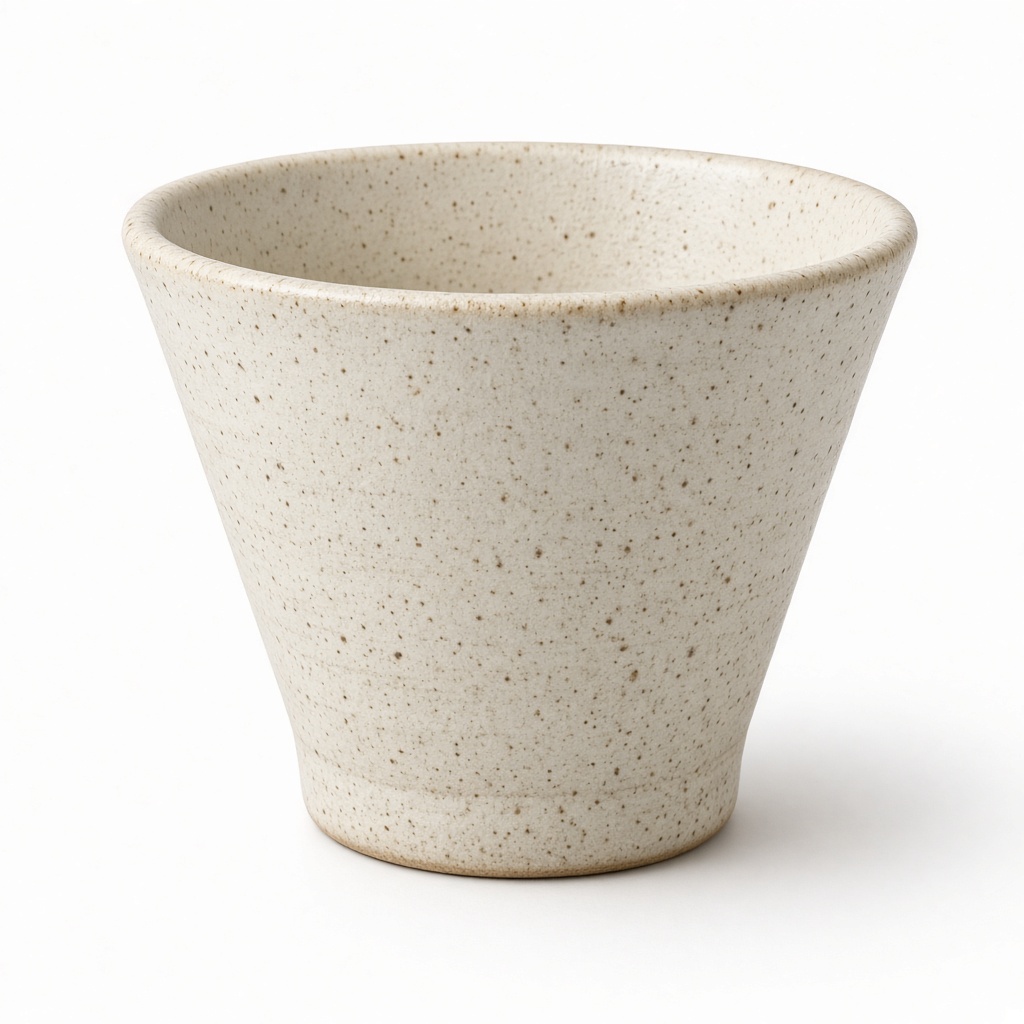
Minimal photography is what most people mean when they say they want their shop to look professional. One object, clean ground, even light, nothing else.
It is also the least forgiving. A styled flat-lay can hide a scuff behind a sprig of eucalyptus; a plain white frame cannot hide anything. Every dust mote, every soft edge, every wrong shadow is the only thing in the picture, which is why the look reads as expensive when it works and as lazy when it does not.
The upside is that it is the only look that scales without effort. There is nothing to restyle when a new product arrives, and forty items shot this way are automatically a set.
Why your photos are costing you sales
The failure mode is specific and very common: white that is not actually white. A wall photographed as a background comes out grey or faintly blue, and a shop where every listing has a slightly different grey behind it looks careless in a way nobody can name but everybody sees.
The other failure is the missing shadow. A product with no contact shadow underneath does not look clean, it looks pasted on — which is the single most reliable signal that an image was cut out badly, and buyers read it instantly even if they could not explain it.
The scenes that suit your work
A handful chosen for what you sell, out of the full library.

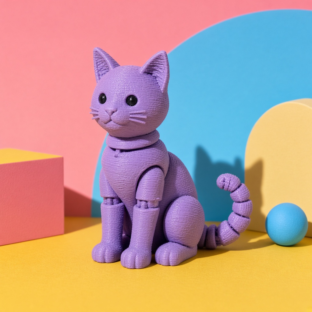
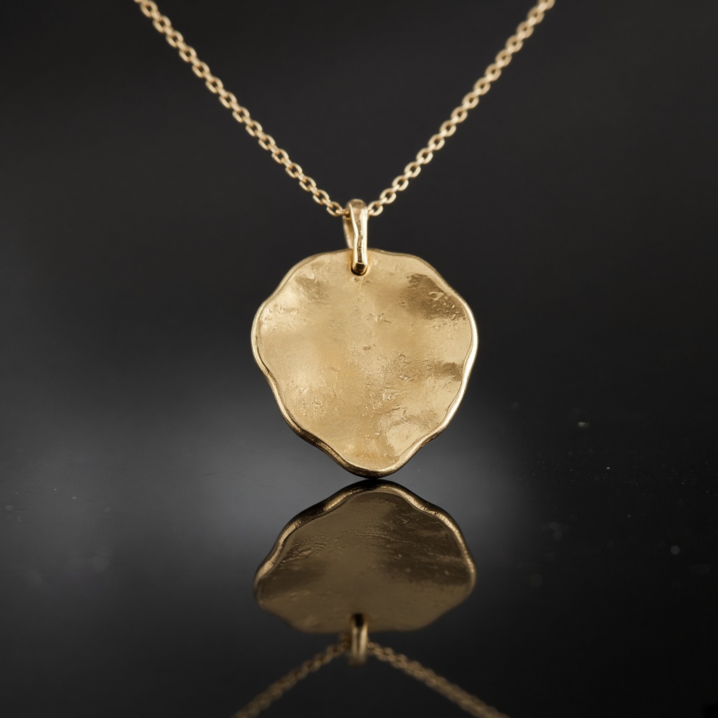
It has to still be your item
Minimal does not have to mean white. A soft two-tone gradient behind the object is still minimal — nothing else is in the frame — but the tone shift gives depth and stops pale products dissolving into the background.
If you sell a range, this is the look that turns it into one. Pick a single ground and hold it across every listing, and the grid does the work that individually better photographs never would. That consistency is worth more than any single image, and it is the thing a shop with forty hand-shot photos can never buy.
- The same white behind every listing, not forty shades of grey
- A real contact shadow, so nothing reads as cut out
- Marketplace-compliant by default
- A grid that looks planned rather than accumulated
Three steps, about a minute
01
Upload your photos
Two or three angles on a phone is plenty. We cut the background automatically.
02
Pick your scenes
Tick as many as you like from 56 staged settings, or describe your own.
03
Get your shots
They arrive together in your gallery, ready to download for a listing or a post.
Questions people ask before they sign up
- Is minimal right for handmade?
- For the first listing image, almost always — it is what marketplaces want and what a buyer scanning results needs. Use a styled or lifestyle scene for images two and three, where the rules relax and the story starts mattering.
- My product is white. Will it disappear?
- On pure white, yes. Use the gradient or the black studio instead; both hold a pale object without the background having to fight it.
- Can I set the background colour?
- Say which one and we follow it. Left alone the gradient picks a soft tone that flatters the object, which will vary from product to product — fine for one listing, wrong for a set.
Also sells like you
Minimal is a decision, not an absence of one
Start with 3 free images. No card, no account.
Try it free