Black Friday product photos
On Black Friday the picture has to win before anyone reads the discount
Everyone is discounting, so the number stops being an argument. What separates two identical offers is which one looks like a shop.
Sized and staged for Shopify · Instagram · Etsy · Skroutz
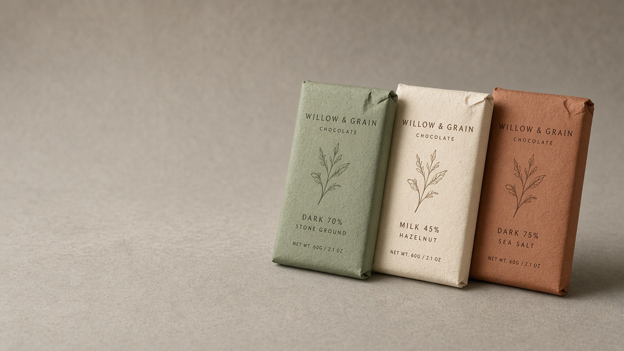
Black Friday is the one week where a small seller competes directly with everyone at once. The inbox is full, the feed is full, and every message is some version of the same percentage.
Which means the discount does very little. When two shops both say forty percent off, the thing that decides between them is whether the photograph looks like a business or like a phone snap on a kitchen table — because one of those reads as a real sale and the other reads as a risk.
The other constraint is format. Most of the traffic that week arrives through a banner, a story or an ad, and all three want a shape a square listing photo cannot fill.
Why your photos are costing you sales
A square product photo dropped into a nine-by-sixteen story gets letterboxed, or cropped so the product loses its top and bottom. Dropped into a wide banner it either sits marooned in the middle or gets stretched. Either way the one image you had is now the wrong shape in the two places that matter most that week.
And there is nowhere for the text. A hero image with the product dead centre forces the headline and the button on top of the product, which is why so many small-shop banners have a percentage sitting across a candle.
The scenes that suit your work
A handful chosen for what you sell, out of the full library.
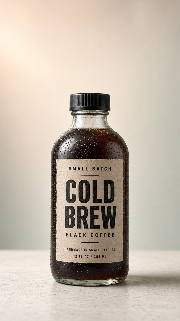
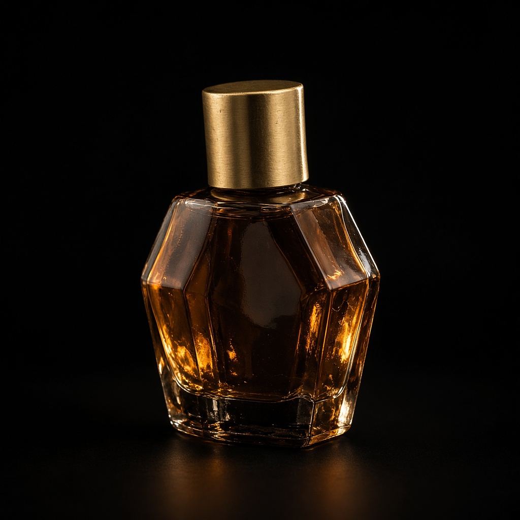

It has to still be your item
Produce the same product in the shapes the week actually uses. The shop hero is built wide with the object off-centre and clean space beside it, which is where your headline goes — a banner without that empty half is a banner that has to sit on top of its own product. The vertical story keeps the object in the lower two thirds, because Instagram and TikTok both put interface over the top of the frame.
Then hold one look across all of them. A campaign where the banner, the story and the listing share a background reads as planned, and planned is what makes a discount look deliberate rather than desperate.
- The same product in banner, story and listing shapes
- Room left for the headline instead of text over the product
- One look across the whole campaign, so it reads as planned
- Turned around in an evening, which is the only notice most sales get
Three steps, about a minute
01
Upload your photos
Two or three angles on a phone is plenty. We cut the background automatically.
02
Pick your scenes
Tick as many as you like from 56 staged settings, or describe your own.
03
Get your shots
They arrive together in your gallery, ready to download for a listing or a post.
Questions people ask before they sign up
- Can it put the discount text on the image?
- No — it makes the photograph and leaves the space for it. Text goes on in whatever you already use for banners, which also means you can change the number without regenerating anything.
- Which shape should I start with?
- The vertical, if you only make one. Story and Reels traffic is where most small shops actually get seen that week, and a vertical crops down to square better than a square crops up to vertical.
- Is it too late if I start in November?
- No. This is an evening of work rather than a booking, which is the entire point — the alternative is deciding in September what you will discount in November.
Also sells like you
On Black Friday the picture has to win before anyone reads the discount
Start with 3 free images. No card, no account.
Try it free