Photographing labels so the text stays readable
Indie cosmetics and skincare · July 11, 2026 · 4 minute read
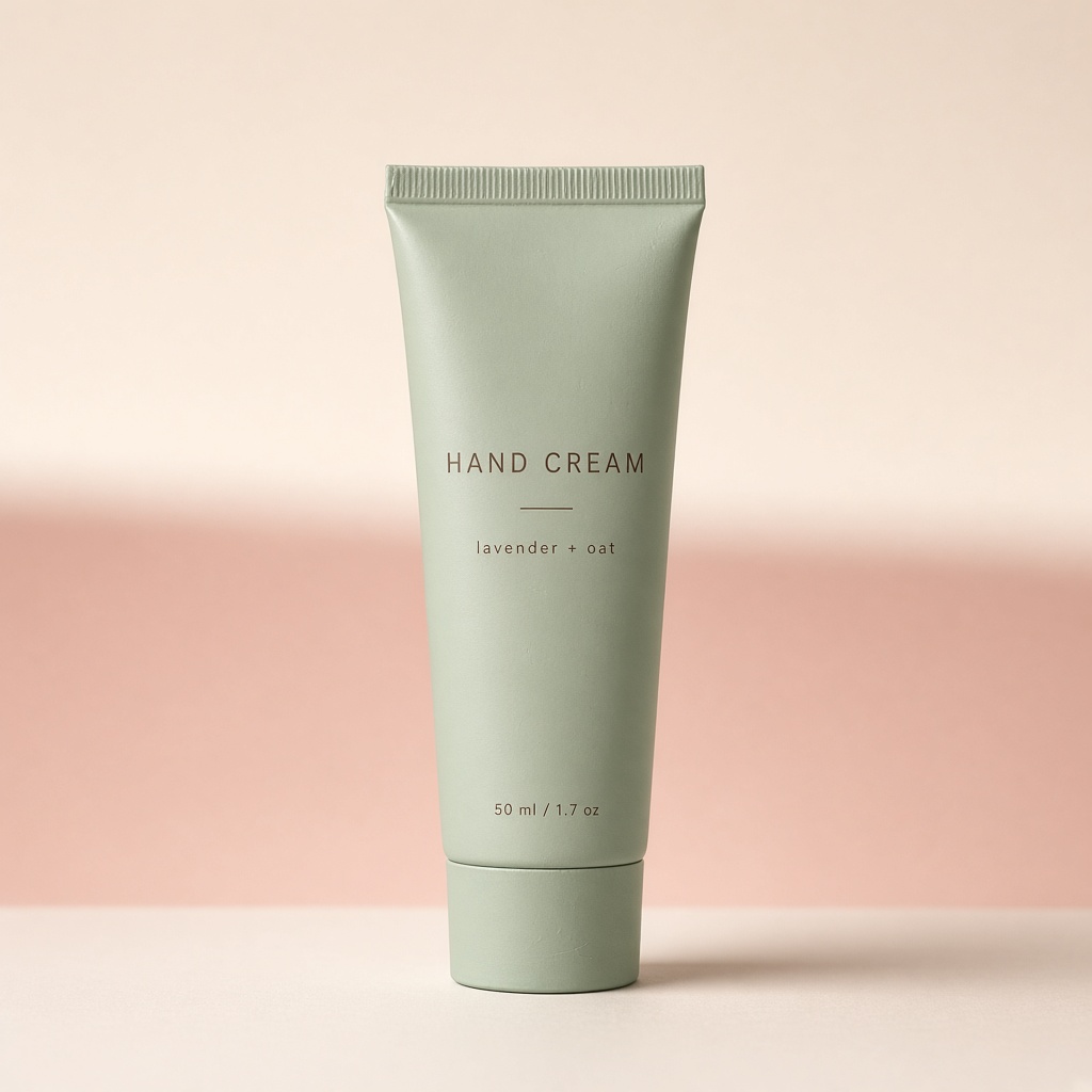
Skincare packaging sets your brand and carries your legal obligations at the same time. The ingredient list, the volume, the batch marking and the claims are all printed on a small curved surface in type that was designed to be read at arm's length, not photographed.
Getting it sharp is a technical problem with a small number of specific causes.
Curvature fights depth of field
A cylindrical bottle presents a label that curves away from the camera. The centre is closer to the lens than the edges, sometimes by a centimetre or more, and at close focusing distances a centimetre is a lot.
Depth of field — the range of distance that appears sharp — shrinks dramatically as you focus closer. Photograph a 30ml serum bottle from fifteen centimetres and your depth of field may be only a few millimetres, which means the middle of the label is sharp and both edges are soft.
Two fixes, both free.
Step back and crop. Photograph from further away and crop in afterwards. Depth of field increases with distance, and modern phone sensors have resolution to spare for a crop.
Turn the bottle. Rotate so the text you most need legible sits flat to the camera rather than wrapping around the curve.
Focus on the text, not the bottle
Phones focus on whatever they think the subject is, which for a bottle is usually the nearest edge or the brightest area. Neither is the label.
Tap the screen directly on the text before shooting. On most phones this also locks exposure to that area, which is usually an improvement too, because it stops the bright bottle body from causing the label to underexpose.
Foil and metallic type need angled light
Foil-stamped and metallic text is reflective, which means it reads as bright where it catches light and as dark where it does not. Under flat frontal light, foil frequently disappears entirely — it reflects the light straight back and reads as a slightly darker version of the substrate.
Foil wants light at an angle, so the stamped areas catch and glint. Rotate the bottle slowly under a side light and watch the text appear and disappear. There is an angle where it reads clearly. That is your shot.
Embossed and debossed type wants raking light
Where the text is pressed into the material rather than printed on it, there is no colour difference at all — only a change in surface height. Flat light makes it invisible.
This wants light coming across the surface at a shallow angle, which throws small shadows into the impressions and makes them legible. It is the same principle as photographing brushed metal, and the same technique.
Photograph every face you are obliged to show
For regulated products, the back-of-pack information matters as much as the front. Photograph it, in focus, legibly.
This serves three purposes: it answers customer questions about ingredients before they are asked, it demonstrates compliance to any marketplace reviewing your listing, and it means an image exists that you can point to if a claim is ever queried.
Marketplaces increasingly require an ingredient-list image for cosmetics. Producing one that is actually readable, rather than a small blurry photograph of the back of a bottle, is a low bar that many sellers miss.
Clear and frosted glass need different backgrounds
A transparent bottle takes on whatever is behind it, and the label sits in front of that. A white background behind clear glass produces good label contrast; a busy one makes the text hard to read even when it is sharp.
Frosted glass is more forgiving but softens everything behind it, including the light, so it wants a brighter source than you would use for opaque packaging.
What restaging must not do
Altered label text is one of the failure modes explicitly excluded on every generation, and this is the category where it matters most. A rewritten ingredient list is not a cosmetic error — it is a product you cannot legally ship, and a compliance exposure if it appears in a marketplace listing.
The same protection covers restyled packaging, so the printed design stays the design you paid for. What moves is the surface the bottle sits on and the light falling on it, which is what you wanted moved.