When a menu photo has to go to print
Menus, boards and displays · August 4, 2026 · 4 minute read
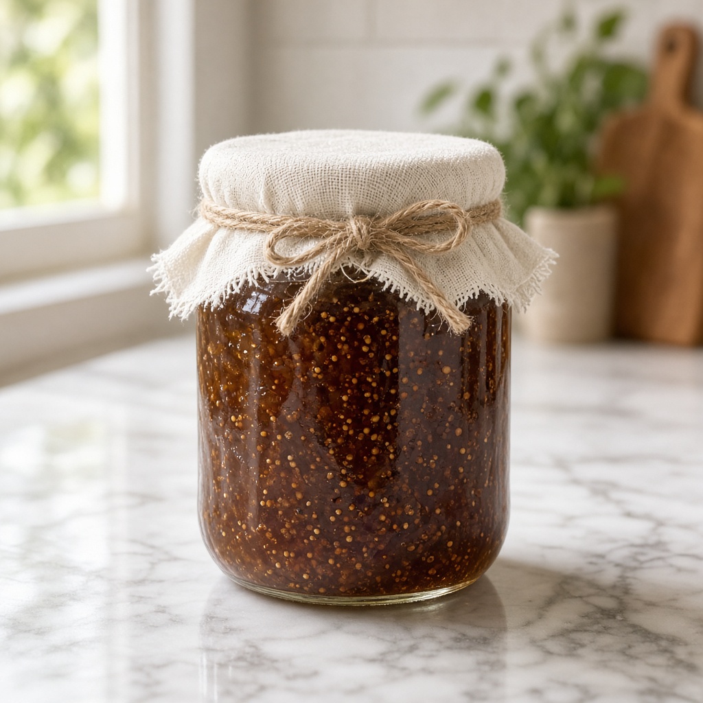
A photograph that is perfectly good on a delivery app can be unusable on a printed menu, and the difference is not quality in any obvious sense. It is resolution, colour space and crop margin — three things nobody checks until the printer emails back.
Resolution: the number that actually matters
Screens need about 72 to 150 pixels per inch. Print needs 300. That is roughly a fourfold difference in linear terms.
Practically: a photograph that will be printed 10cm wide needs to be about 1,200 pixels across. One printed 20cm wide needs 2,400. A modern phone shoots around 4,000 pixels wide, so you have room — but only if you have not already cropped hard.
The failure is almost always cropping. You crop to the dish, upload the crop, delete the original, and six months later the menu designer needs it at A4.
Keep the originals. Everything else follows from that.
Shoot wider than you need
Menus, boards and posters crop in ways you cannot predict. A designer may need the dish square, or as a wide banner, or with space at one side for text.
Photograph with generous margin around the dish. It costs nothing, and it means one photograph serves the app thumbnail, the printed menu and the poster in the window.
If you know text will sit over the image, leave a deliberately plain area — a stretch of tablecloth or board with nothing on it — where type can go.
Colour: expect it to shift
Screens are backlit and additive; ink on paper is neither. Colours that look vivid on a phone print duller, and this is physics rather than a mistake.
Deep reds, bright oranges and saturated greens shift the most, which is unfortunate given what food looks like. A tomato sauce that glows on screen prints browner.
Two practical responses. Photograph slightly brighter and less saturated than you think you want, and ask your printer for a proof on the actual stock before you commit to a thousand menus.
Matt stock eats contrast
Uncoated and matt papers absorb ink and lower contrast noticeably. Photographs printed on them look softer and darker than the same file on gloss.
If your menu is on a heavy uncoated stock — which many restaurants choose for good reasons — your photographs need more contrast and slightly more brightness than they would for screen.
Ask the printer what stock is being used, and ask for a proof. Printers expect this question and are usually happy to answer it.
File formats: give the designer what they need
Send the largest version you have, as a JPEG at maximum quality or, better, whatever the original file is.
Do not send images through a messaging app. WhatsApp and Messenger recompress aggressively and will hand your designer a 1,000-pixel file with visible artefacts, regardless of what you sent. Use a file transfer service, a shared drive, or email as an attachment.
This single mistake accounts for a large proportion of the "the photos look bad in print" conversations that happen after a menu is printed.
Check before the run
The last step, and the one most often skipped: look at a physical proof at actual size before the full run.
A photograph that looks acceptable on screen at 20% zoom can show noise, soft focus or compression artefacts at full size on paper. Ten minutes with a proof prevents a print run you will look at every day for two years.
Where restaging fits
Restaging works from your photograph and returns a full-resolution image, so a dish photographed at the pass can end up on a printed menu without an intermediate photo shoot. The dish, its plating and its portion are preserved from your capture.
The resolution constraint still applies at the start: photograph at full resolution, do not crop before you stage, and keep the original. What you feed in bounds what you get out.